Modern observability requires more than just collecting data; it requires making that data actionable. However, as infrastructure grows to span Kubernetes clusters, serverless functions, and dozens of microservices, time-to-value for a new dashboard often ranges from minutes to hours.
Engineers frequently find themselves manually hunting for metric names, configuring complex Y-axis scales, and fighting with JSON schemas just to get a basic overview of a new service.
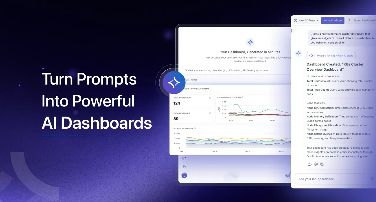
Today, we’re introducing the Middleware AI Dashboard Builder. By using natural language processing, we are moving from “manual configuration” to “intent-based monitoring.” You describe the objective; we build the visualization. You tell the AI what you want to see, and it builds the production-ready dashboard for you.
The Challenge: The “Empty Canvas” Problem
Building a dashboard from scratch typically involves three points of friction:
- Metric Discovery: Knowing exactly which metric (e.g.,
system.cpu.utilization vs process.cpu.usage) represents the health of your specific stack. - Context Switching: Jumping between documentation and the dashboard builder to understand which attributes (like
spanIdorservice.name) are available for filtering. - Layout Fatigue: Manually resizing and grouping widgets to create a logical flow for on-call engineers.
Introducing the AI Dashboard Builder
The Middleware AI Dashboard Builder acts as an intelligent orchestration layer between your raw telemetry and your UI. Instead of hunting for buttons, you use natural language to define your observability goals.

See it in Action: Generating a Dashboard with a Single Prompt
Check out this quick walkthrough of how the AI transforms a natural language prompt into a fully functional dashboard:
👉Stop fighting your data and start using it. You can be up and running with Middleware in under five minutes no complex migration or steep learning curve required. Start Your 14-Day Free Trial
How it Works: From Prompts to Production
The AI Dashboard Builder eliminates these hurdles by acting as an intelligent orchestration layer between your telemetry data and the visualization UI.
1. Intent-Based Generation
Instead of picking a “Time Series” widget and then selecting a query, you provide a high-level goal. For example:
“Create a Kubernetes health dashboard for nodes, pods, CPU, memory, and network.”
The AI parses this intent, identifies the relevant telemetry being ingested from your environment, and selects the optimal visualization type (gauges for health, heatmaps for distribution, or time-series for trends).
2. Context-Aware Widget Creation
You aren’t limited to full dashboards. If you have an existing production dashboard and realize you’re missing error context, you can iterate incrementally:
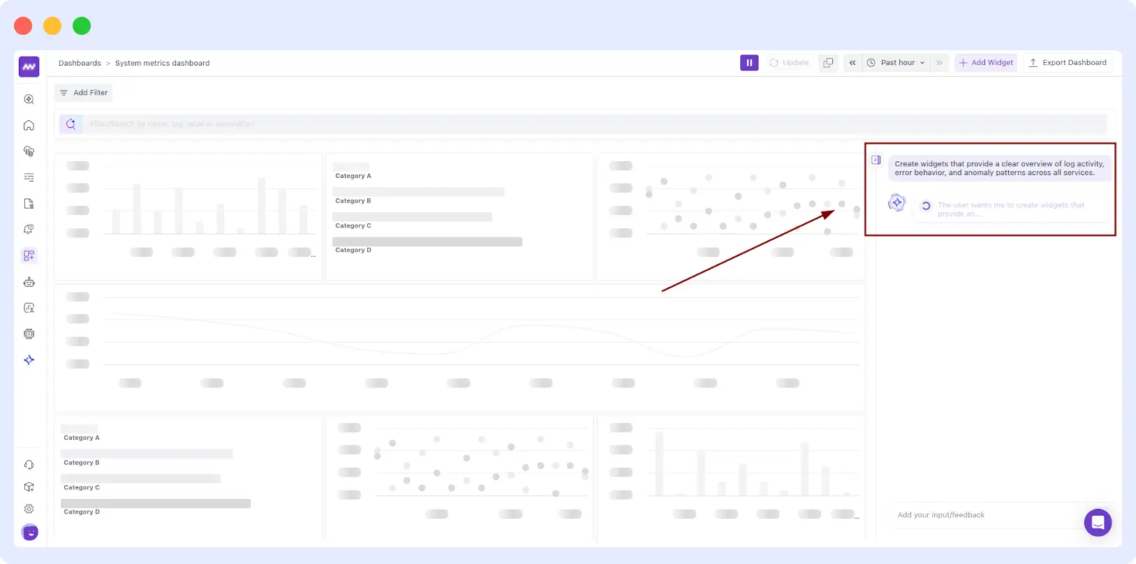
“Create widgets that provide a clear overview of log activity, error behaviour, and anomaly patterns across all services.”
The AI recognizes the service.name attribute and the severityNumber from your logs to build a grouped bar chart or stacked area graph instantly.
If you already have a dashboard, you can build it up gradually by asking AI to add just one widget at a time. This is ideal when you want to iterate without changing the rest of the layout.
“Add a widget for log volume by service.”
“Add an errors by service widget for the last week.”
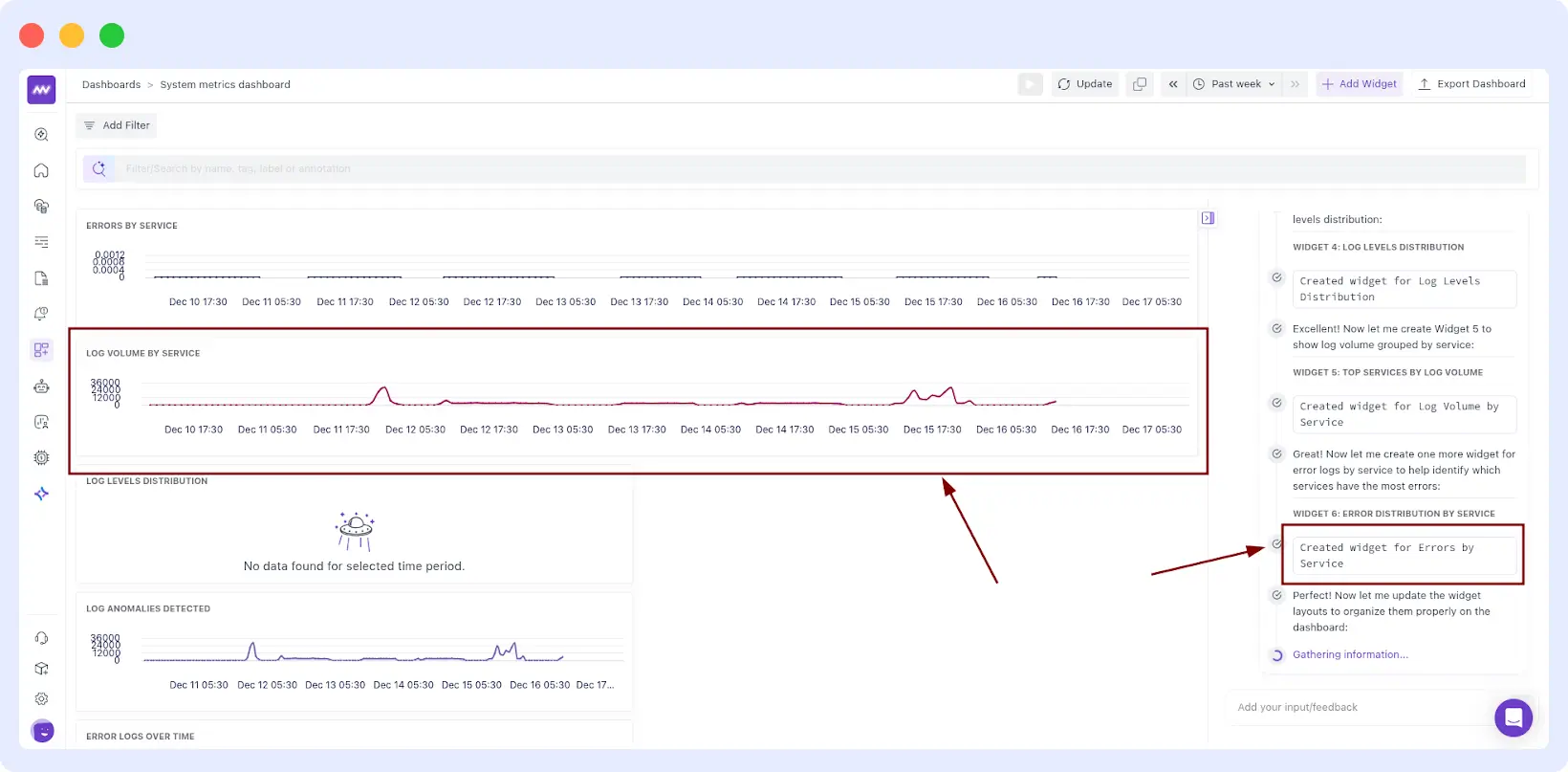
3. Automatic Data Validation
The AI doesn’t just “hallucinate” graphs. It validates that the underlying telemetry, whether from AWS, NGINX, or custom OpenTelemetry traces, is actually being ingested. If the AI detects that a service isn’t instrumented, it displays a summary panel outlining what was created and what may be missing, reducing the frustration of “No Data Found”.
Data Insights: Depth for the Power User
While AI builds the foundation, the builder provides an “engine room” for deep-dive engineering analysis.
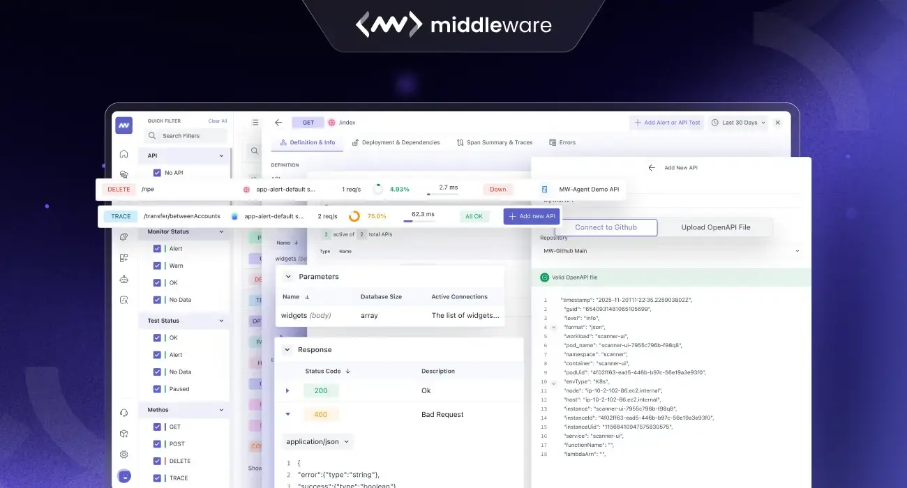
Advanced Querying & Boolean Filters
Precision is key. Our builder supports complex Boolean expressions (AND, OR, NOT) and advanced operators like REGEX, ILIKE, and IN. You can group and nest conditions using brackets to control exactly how data is filtered.
- Example: (host.id != prod-machine AND os.type == linux) OR status == stop
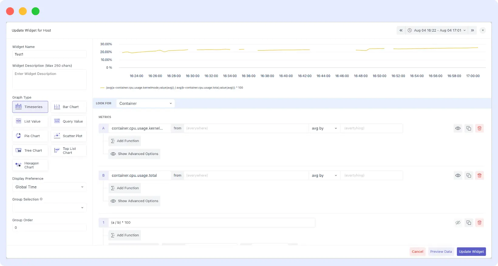
Formulas, Functions, and Time-Shifting
- Custom Formulas: Assign letters to your queries (a, b, c) and write expressions like (a / b) * 100 to calculate error percentages on the fly.
- Post-Process Functions: Transform raw counters into meaningful rates using Per Second/Minute/Hour Rate or Monotonic Difference to ignore resets in cumulative series.
- Time Comparison: In the Query Value graph, toggle “Show Comparison with Previous Time Period” to see instant percentage changes (e.g., a 7.3% decrease in latency vs. the previous hour).
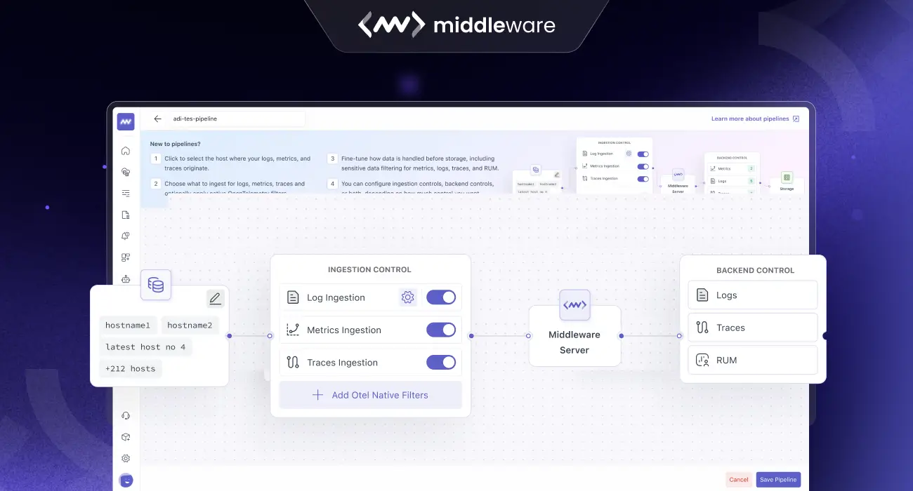
Advanced Filtering: Narrowing the Noise
A dashboard is only as good as its ability to isolate issues. AI-generated dashboards in Middleware come pre-configured with intelligent filters. You can stack conditions like is_anomaly, traceId, or severityText to drill down from a global view to a single failing container in two clicks.
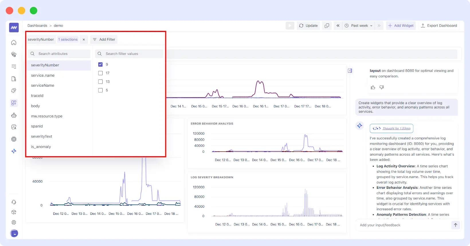
It also applies Filters automatically. If your prompt specifies “production,” it looks for tags like env:prod or namespace:production to ensure you aren’t seeing development noise.
Built for Flexibility: The Custom Builder GUI
While the AI is the fastest way to get started, we know that sometimes you need “pixel-perfect” control. Our overhauled GUI Dashboard Builder gives you a “No-Code” way to refine what the AI started.
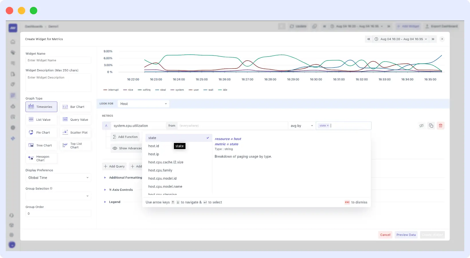
The New Widget Editor
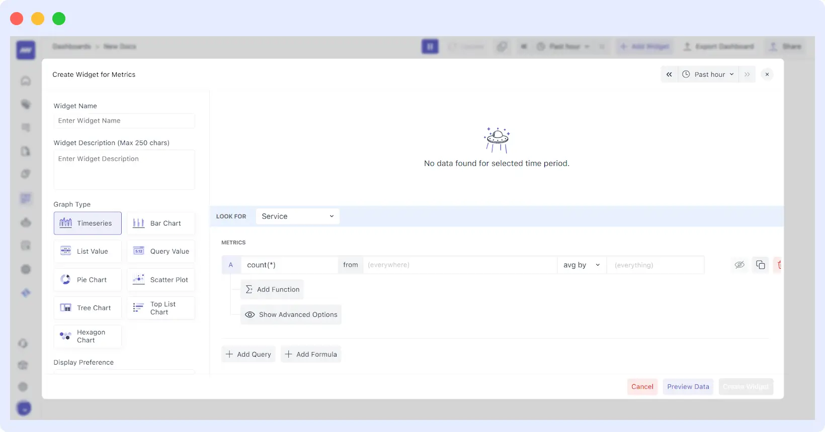
The editor is now split into three logical sections to keep you in flow:
- The Top Bar: A live preview with a dedicated time-range picker so you can see your changes against real data in real-time.
- The Left Panel: This is your “High-Level Intent” area. Name your widget, add a description, and choose your visualization type (Pie, Scatter, Tree, Bar, or the classic Timeseries).
- The Right Panel: The engine room. Here, you can fine-tune the Query Data, add complex Formulas, and set Advanced Options like Y-axis scaling.
Advanced Grouping & Ordering
Organizing a dashboard for an entire team requires structure. We’ve introduced Group Orders. You can now assign widgets to specific groups (e.g., “Database Health” vs “Frontend Performance”).
By setting a group order number, you ensure that even as you add new widgets, your dashboard remains logically sorted for an on-call engineer at 3:00 AM.
Collaboration: Visibility for the Whole Team
In the past, sharing insights was a chore. You’d have to take screenshots, export CSVs, or, worse, grant manual permissions to every single stakeholder so they could see a basic uptime graph. Middleware has reimagined this workflow to ensure that your AI-generated insights are as easy to share as they are to build.
1. Collaborative Troubleshooting during Incidents
When a critical service goes down, the last thing you want is three different engineers looking at three different sets of data. Middleware’s dashboards serve as a single source of truth. Teams can share live, interactive dashboard links that maintain the same time range and filter context.
This means that when a Lead Engineer or Product Stakeholder views a dashboard, they see the same spikes and log errors in real time. This shared context eliminates the “it works on my machine” mentality and slashes the time spent in war rooms.
2. Stakeholder-Ready Reporting (The “Shareholder View”)
Shareholders and executives don’t need to see every micro-latency spike, but they do need to see high-level trends, SLA compliance, and resource ROI.
The Middleware Dashboard Builder allows you to create Visibility Tiers:
- For Devs: Deep-dive views with trace IDs and granular system metrics.
- For Shareholders: High-level “Executive Summaries” that aggregate complex data into readable KPIs like System Health Score or Cost Per Request.
By providing these clear, digestible views, engineering teams can communicate their value to the business without getting bogged down in technical jargon.
3. Granular Access & Permissioning
Collaboration shouldn’t mean compromising security. Middleware enables precise visibility management. You can invite colleagues to specific dashboard folders, grant “View Only” access to external stakeholders, or provide full “Editor” rights to your core DevOps team. This ensures that while everyone has the visibility they need, the core configuration remains protected.
Why This Matters for MTTR
Ultimately, observability is about reducing Mean Time to Resolution (MTTR). Every minute spent building a dashboard or navigating a UI is a minute an application is down.
By automating the creation of these views, Middleware is helping teams:
- Democratize Data: You don’t need to be an “Observability Expert” to get answers. Anyone from a junior dev to a product manager can create a dashboard.
- Reduce Tool Sprawl: With metrics, logs, traces, and AI insights in one place, you stop paying for multiple tools that don’t talk to each other.
- Improve Productivity: Users can achieve an 80% increase in dev productivity by spending less time on “Observability Ops” and more time on features.
Stop wasting time on manual queries. Sign up for Middleware and let AI handle your dashboarding today.
Getting Started
To start building with AI, ensure your integrations (Kubernetes, APM, etc.) are connected so the AI has a data catalog to work with.
- Navigate to Dashboards → Create Dashboard.
- Enter your objective in the Prompt Box.
- Refine and add widgets using natural language.
By moving the focus from how to query to what to monitor, we’re helping teams spend less time building dashboards and more time fixing the issues they reveal.
Ready to automate your observability? Check out our documentation or get started for free.